I created this portfolio for the CME 151 course (Introduction to Data Visualization) in Winter 2016. In this class, I learned about priciples of graphic design for presenting high-dimensional data, usage of libraries such as C3.js, D3.js, Processing.js, and Three.js for creating visualizations, and modular architecture for building complex visualizations in JavaScript.
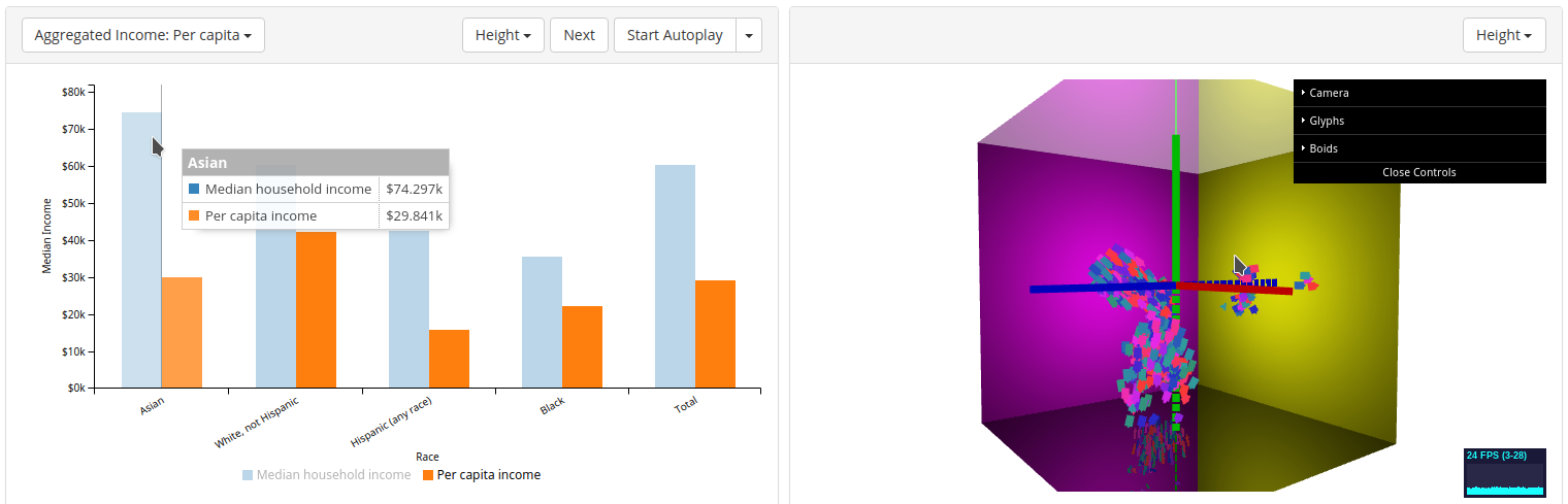
For this portfolio, I created two visualizations. The first, Disaggregating the Model Minority, used interactive visualization techniques to convey demographic data with important policy implications for Asian American communities. The second, Boids in Three.js, explored the use of overlap and reflection as well as visual cues in displaying the motion of flocking elements in three-dimensional space.